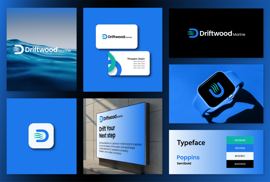
About the brand
The Story
A premium marine logistics brand inspired by the natural texture of the ocean and weather resistant coastal elements. The company provides robust maritime engineering, cargo transportation, and supply chain solutions over deep-water channels. Utilizing a crisp color structure of deep sea blue, marine teal, and clean white, the identity establishes an atmosphere of absolute reliability, enduring structural strength, and a deep-seated connection to commercial shipping routes.
The design relies on a minimalist corporate emblem that weaves three flowing horizontal waves inside the negative space of a bold, structural letter “D.” The stylized waves convey steady aquatic motion, water currents, and maritime transit, while the enclosing curve of the monogram represents protective shipping hulls and operational security. Paired with the geometric sans-serif typeface Poppins Semibold, the clean wordmark projects an image of stable corporate infrastructure, proving highly versatile for large-scale shipping containers, digital freight dashboards, and industrial corporate equipment.