About the brand
The Story
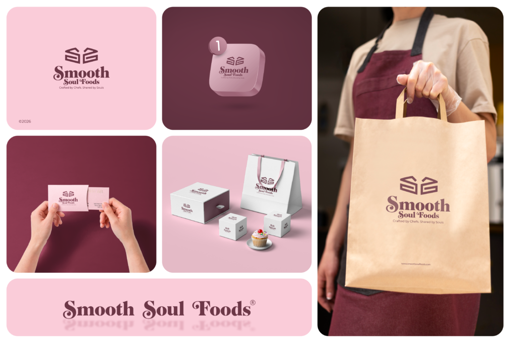
A local boutique bakery specializing in fresh-baked goods, everyday pastries, and custom treats. The shop moves away from generic, overly rustic bakery aesthetics by blending a clean layout with warm, welcoming hospitality. Utilizing a color story of soft petal pink and rich plum burgundy, the brand creates an inviting, accessible atmosphere tailored for neighborhood dessert lovers seeking high-quality, handcrafted sweets.
The design relies on a balanced, geometric icon sitting directly over a custom serif wordmark. The emblem features two interlocking, mirrored “S” shapes that form a unified mark; this structural arrangement also doubles as the silhouette of a multi-tiered cake, cleverly embedding the bakery’s signature specialty into a clean, modern emblem. Below the icon, the brand name is executed in a typeface with fluid, swirling curves and rounded edges, bringing a soft, organic warmth that reflects the comfort of fresh baking. This balanced visual signature ensures a clean, easily recognizable look on kraft paper shopping bags, pastry boxes, staff aprons, and storefront.